Mike Mignola is someone whose work has definitely had a massive impact on the way I think both aesthetically and conceptually since his talk in first year. I really like the way he uses the dark and negative space to tell as much story as what he draws. Shadow is something that I still don’t properly understand in my work, but it's something that I feel definitely gives a lot of atmosphere and character. I’ve started to utilise negative space a lot in my COP work right now but I thought I should talk about the work that's fuelling those decisions in regard to my studio practice.
The noir look of Mignola’s work is something that gels quite well with the aesthetic themes I’m looking at in developing this concertina book, so I’ve started to combine the two in early roughs. Still finding it quite hard to balance this with COP, not sure how much time to dedicate to each module, but I think it will be a lot easier to focus and think once I’ve finished the work I need to do for the dissertation and that module.
Saturday, 2 December 2017
Friday, 1 December 2017
IDER - body love - digital illustration
The idea behind this cover was to communicate the duality of a relationship. One viewpoint is romantic and organic, represented by the photograph of the rose. And the other viewpoint is colder and pragmatic, represented by the harsh shapes making up the silhouette of the rose. Making the flower angular was a way for me to tell the story about this colder view of a relationship, while still keeping the obvious connotations of a rose present in the overall design. This cover was also featured on the band’s Instagram account, which was great because I was able to look at the work in context, and have the people who actually made the music see my interpretation. On the flip side of that, as soon as it was posted I immediately thought of ways I could have made the design clearer or more expressive. I might work further on this design before really thinking it's finished.
Wednesday, 29 November 2017
Tutorial & moving forward - get strange..
After my last tutorial I do feel a fair bit better about my practice as a whole, as I sort of felt the music project I have been doing so far is a bit sporadic, so it was good to hear that it is getting more of a direction recently. The Polygondwanaland idea can be a good way to move forward with this project, as zeroing in on a certain piece of music for an extended time might give this project more bulk and direction.
Discussing the strange nature of the album (how the songs aren't really distinct and the album works as more a single piece of music stretched out over an hour, telling a strange neon medieval story), an idea that sounds good was that of a concertina book. I wanted to make more books this year as I really enjoyed book binding last year and want to put it to use. Concertina books are a bastard, I remember from first year, but if they’re done right they can be really cool and effective. The main idea is to make a book that illustrates the album as a whole (when the book is fully folded out) and communicates something about each song on the inner pages. I’ve very roughly started to sketch out these ideas, but I’m also trying to balance COP and the dissertation right now, so I might revisit this when we have more time after christmas and the 601 deadline.
Sunday, 26 November 2017
King Gizzard inspiration
Working on the King Gizzard design for the last brief has re-started my interest in the aesthetic present in weird 80s shows like Masters of the Universe. I love the neon nonsense presented in sprawling and majestic fantasy environments, the juxtaposition gives me a lot of ideas.
Friday, 24 November 2017
SOYOUNG Magazine - competition brief
Recommended Listening: King Gizzard and the Lizard Wizard - Wah Wah
Recently I’ve been trying to combine the digital skills I developed throughout last year and this summer with the more traditional hand drawn elements of how my work has been in the past. While I really enjoy working digitally, I’m conscious that I don’t want everything in my practice to be based on a screen, I still find doodling weird creatures and symbols a good way to get ideas out, and I don’t want to lose that in my work going forward.
With that in mind, I tried to combine the two forms of working in this entry for the soyoung magazine illustration competition. Instead of adapting a specific song as I usually would, I tried instead to get a feel for the band’s music as a whole, how it plays and what imagery it evokes. King Gizzard and the Lizard Wizard make me think of a sort of neon medieval future, similar to the sort of aesthetic seen in shows like He Man and Flash Gordon. I really love the over the top cartoonish nature of this aesthetic but combined with very spooky and atmospheric environments. The juxtaposition is what really sells this for me, so I wanted to capture both the zany and the spooky in this design.
Tuesday, 21 November 2017
POLYGONDWANALAND
The latest album by King Gizzard and the Lizard Wizard has been released, and I’ve started to develop ideas for a separate project surrounding it.
The album only exists digitally, as the band have not put the music into a tangible form. So no records, cds or tapes or anything exist with this music on. Their site encourages fans to make their own versions of this record however they want, they even provide all the necessary files to do so. I love this guerilla marketing strategy, it gives the music this extra dimension of universality, and feels very much like it belongs to everyone and no one at the same time.
I want to try to make some cassette tapes to go alongside a series of illustrations for the songs. Although, the way the album is set out makes it more of one huge sprawling song across the time frame, rather than the songs being very distinct themselves. Not sure how exactly to approach that yet, as it's hard to pull certain things from each song, as sometimes it's hard to know exactly where they begin and end.
Wednesday, 4 October 2017
Wolf Alice - gifs & animations
- Recommended Listening: Wolf Alice - Don’t Delete the Kisses
Continuing (a little) with animation, I tried to capture two disparate emotions in a similar method, if that makes sense.
Instead of a huge animation, I tried a few looping gifs that are clear without being over the top. This one I feel is the less subtle of the two, but the song itself is a very overtly aggressive one (lyrics include: “Am I a bitch to not like you anymore? Punch me in my face I won’t even fight you no more”). While it was a change of pace, I definitely feel the second gif is more effective. - This song is very lyric heavy and overtly romantic, in the classic more tragedy-centric sense. Because of this, as well as the lengthy title and swelling instrumentals that dominate the back end of the song, I felt a little overwhelmed when approaching it, as it feels like a very complete and full thing already.
So I left it for a while and dawdled on other stuff.
But then I basically thought, if you can't tell everything, then tell nothing. Does that make sense? I hope that makes sense.
I basically just wanted to give a small look into the narrative made by the song, by showing a simple image that anyone who’s ever written a nervous message to anyone else can understand. Literally as I type this the cursor stops and blinks along, as if the whole world is waiting to see what you’ll write next. I wanted to communicate this nervousness and trepidation in the simplest way possible.
Monday, 2 October 2017
The Big Moon - music designs
Recommended Listening: The Big Moon - Sucker
I want to double down this year on the musical side of my practice, because interpreting songs through illustration has been really beneficial for me not only as a visual communicator (la dee da) but also just in general. I find it a healthy way to get emotion out in a tangible way that I can look back and reflect on. I guess it's like a diary sort of, but for everyone to look at.
I’m still floating between literal and lateral thinking when approaching some of these songs. The idea for this one stemmed from the music video being set in the Old West, so I thought the visual of a Revolver barrel would link well to that, as well as the lyrics of the song basically saying the speaker is helpless to resist how they feel, at proverbial gunpoint from their own feelings. It's a simple and honest message so I thought black and white translated pretty well.
On the other hand, this song deals with the support friends have for each other, and how it's easy to feel alone sometimes. Visually I didn’t have much to go on so I simplified how I was thinking and just tried to tell the story through colour and composition. Although all the yellow shapes are clustered together and the composition suggests they are there to support the pink shape, I definitely wanted them to remain different colours, to communicate the fact that sometimes you just feel separate, even when there are lots of people there to help.
I’m really getting a lot out of working this way, I feel more aware of my decisions and like I’m understanding my own thought process more.
Saturday, 30 September 2017
Baby Driver - animating alongside music
Following on from the brief (and very remedial) experience I’ve had up to this point with animation, I wanted to make an effort to make strides with it this year. Not sure how much it will play into my work as a whole, as I really don’t feel I’m good enough at it to warrant focusing entirely on it, as it might end up as a waste of time. Animating always feels a bit flat to me, like I’m working on part of a greater whole and for that reason, it never feels finished. I came a bit closer to feeling like I had finished animations with the shorts I made last year during 504 for Shakespeare. Those had sound effects and that made it easier and a lot more fun to animate around.
SO
I don’t really know why I never thought to make the connection before, but music was the obvious answer to the problem I’ve been having with this medium. (dahoy).
Baby Driver is a film that I really connected to on an aesthetic level because it's meticulous, and I can tell at times during it's editing/production it will have been infuriating, and it's reassuring to see work in the world like that, because I often become stressed trying to visualise an idea. Basically every shot and movement in the film is synced to a soundtrack, but in a way that makes the sound almost a character in the film. Every gunshot, or car door slam, or camera angle change is linked to a beat or a sound in a song. So when animating this, I made sure I understood the music inside and out before starting, so a narrative could form in the spaces left in the song. The first idea that made me want to make this was the quick drum break that has exactly five beats, the same number of stars given to the film by Empire magazine. I basically just thought the idea of linking that audible number with a visual number was really cool, and wanted to translate the rest of the song into a visual story.
I’m really happy with how it's turned out, animating alongside music is annoying and hard and takes far too long and you need to know every change in the song as well as exactly what needs to go where in time for certain things to take place *BUT* apart from all that, it’s actually a lot of fun to do.
Baby Driver is a film that I really connected to on an aesthetic level because it's meticulous, and I can tell at times during it's editing/production it will have been infuriating, and it's reassuring to see work in the world like that, because I often become stressed trying to visualise an idea. Basically every shot and movement in the film is synced to a soundtrack, but in a way that makes the sound almost a character in the film. Every gunshot, or car door slam, or camera angle change is linked to a beat or a sound in a song. So when animating this, I made sure I understood the music inside and out before starting, so a narrative could form in the spaces left in the song. The first idea that made me want to make this was the quick drum break that has exactly five beats, the same number of stars given to the film by Empire magazine. I basically just thought the idea of linking that audible number with a visual number was really cool, and wanted to translate the rest of the song into a visual story.
Tuesday, 19 September 2017
travelling man - British film & tv brief
I’m still trying to understand typography as a visual storyteller after doing a fair bit with it at the end of last year and throughout the summer. I just love the idea of a couple of stark hard hitting words that really clearly communicate something. I think it stems from a childhood love for film posters and album covers. But I still feel like it's very much something I’m getting to grips with, and I’m trying to test out how I respond to type before properly implementing it in my practice.
Having this print up in Travelling Man is great too, because I haven't really seen my work properly in context before. So having it hanging above a load of comic books is a miniature dream come true.
Tuesday, 9 May 2017
Monday, 8 May 2017
Final outcomes - VALKYRIE
While I'm happy with the colour choices and composition used for the text page for Valkyrie, I think her character illustration is the weakest of the set. She was the last one to complete on my list and with simultaneous responsive and cop deadlines I let this fall by the wayside a bit and could have dedicated more time to making sure she was right before wrapping the project.
Valkyries are female warriors that appear on Viking battlefields to carry off dying soldiers to Valhalla, where they will feast and fight forever. I based her design here on my earlier Thor illustration, as most of the existing depictions of Valkyries have them very scantily clad, which I don't feel works anymore, especially in this project.
I feel that she could be more distinct from Thor than she is, and I could use different colours and shapes to achieve this, but time constraints meant I didn't have enough time as I would have liked to be able to mess around and make sure she was right. I'd also revise her general shape, as I don't think she communicates the character of warrior woman as clearly as the other female character, Hela, does.
Final Outcomes - HEIMDALL
I feel happy with this outcome as I tried to capture a specific characteristic in the design and I think I did quite well. Heimdall is the gatekeeper of Asgard, a stoic guardian of few words. To express this simplicity I stuck to variations on primary colours, and blocky reds and browns to convey an earthen, trustworthy figure. I think in the future I'd change the colours around to investigate more successful ways of expressing these ideas.
Final outcomes - HELA
While I'm happy overall with these two pages, I think the general design of Hela's character and the colour palette kind of makes these feel like they're from a different book.
Hela is basically the god of death and bad things in Norse myth, I wanted to get that across with an intimidating silhouette and colours that contrasted but weren't similar to any others in the book. Because of this though I'm not sure that it totally works with the others as a set. In the future I'd choose a different god to illustrate that would fit in with the other characters more cohesively.
Final outcomes - ODIN
With Odin, I tried to break out of the mold of the shape boundaries I set myself, as the King of Asgard should have his own thing, surely?
I wanted to convey his size and power in the same format as the other illustrations without changing the formatting, so I thought it appropriate that his character refuse to be constrained by the visual boundaries I established for him, and let his size dominate the frame.
I think this was successful as he feels to me like one of the more unique ideas I've had with these outcomes. I wanted him to appear complex to reflect his importance as king of the gods, without overcomplicating him. I definitely wanted him to be a striking and memorable presence among the book, and I think making him the biggest sod in it works well towards this goal.
Final Outcomes - LOKI
I had some difficulty with the design of Loki, because he doesn't fit into the stocky mold of a Viking god, being a slippery boy known for sneakiness and mischief. I wanted him to have a reserved look rather than the big blocky look of Thor and Odin, so I based his design on more snakelike imagery. I found that simplicity was the way forward too, as I was trying to recreate his horned helmet and elaborate shoulder pads, but when I tried to put too much detail into this aesthetic it just became lost and didn't look like anything. After a lot of faffing, I decided to reduce these elements to basic shapes to communicate the general aesthetic rather than trying to visually replicate Viking armour in circles and squares.
This process has been something I've been adapting to loads this year, focusing on ideas rather than fiddling with visuals to an extent that the image is diluted and the concept lost.
Final outcomes - THOR
I think this version of Thor is probably the most solid of my outcomes, I wanted him to evoke thoughts of 80s action heroes like He Man, Conan or any number of other barbarians. I based his asymmetrical look on a combination of these aesthetics and how he appears in the Marvel films. I feel like the way I think about character design has changed radically through these illustrations, as I found it a lot easier to understand proportion and the balance of colour in this digital medium rather than in my sketchbook.
I think this is the way I want to think about character moving forward, I find this way of working a lot better as I get bogged down and often annoyed with myself and my work when continually working in a sketchbook. I think my work can really suffer when I do this, as I get pissed off with my inability to realise something on paper and then leave the idea and end up settling for something weaker. To counter this I'm trying to be more confident in my idea generation and focusing on getting my ideas out in one medium or another.
Final outcomes - Title page
I've really enjoyed working with block shapes in my 80s investigation of Norse mythology. I bought a font called Thunderstorm (totally radical) to experiment with and it proved to be successful for the look I was going for.

I used common imagery and tropes from that period of popular design to try and create an immediacy in my own designs and root them firmly in that colour explosion of a decade.
I've never used this kind of shape exploration prominently in my work before, so I thought it'd be a good idea to do some research into the style of composition first. I came across this design from 1922 by Iakov Chernikov, who was a Russian architect and graphic designer. This constructivist design is something I never would have thought to look into for inspiration at the start of this year, but the way that shape and colour are so carefully considered leapt out to me as an interesting way to tackle my illustrations for this project.

Sunday, 30 April 2017
Digital roughing
I've not been finding my sketchbook a successful place to develop ideas recently because it takes me a long time to figure out hand drawn sketches in a way that I'm happy with, and with the little amount of time we've had going up to all these deadlines, I chose to stick to digital roughs moving into finishing up my final outcomes.
I'm experimenting with different ways to get across the basic shapes and colours of each character, I don't think either of these are near a finished point because their proportions don't lend well to a head on top (which is kind of vital to character design).
However I'm getting a lot more comfortable with how the colours are turning out, I think contrast is the key to make these illustrations pop in a memorable way.
Thursday, 27 April 2017
Secret7 - Banks: This Is What It Feels Like
My aim with this cover was to communicate an idea without using traditional imagery. I felt that this particular song should be illustrated without depending on just images and objects, as it is a song purely about the speakers feelings and perceptions, nothing tangible.
Banks' pre-existing logo was a starting point for me in thinking about how to visually represent this song. It's all very geometric and based around symmetry and line form. These aren't aesthetic decisions I'm really comfortable with or experienced with, so I took this opportunity to give it a crack.
While I definitely think that this design could do with some extra development, I'm happy with how it exists alongside the song. This Is What It Feels Like illustrates a speaker who has opened up to someone else, only for them to suddenly retract and reject their feelings. I wanted the two circles to act as the two members of the relationship, connected but separated by complex barriers. The sound of the song is subdued and there's a tone of disappointment in Banks voice, I thought the best way to communicate that sense was by using underwater imagery in the background. The song sort of reminds me of someone being submerged, a floaty disregard for what she's even saying permeates the song, like she is so tired of feeling this way that she doesn't even really feel it anymore, and is just tired.
This overarching vibe is what I tried to capture in my illustration, and its why I didn't want to use traditional imagery as I don't feel it would have done justice to the ethereal nature of the song, or the confusion the speaker is feeling. I enjoyed working with more abstract concepts and visuals with this, as it presents the challenge of suggesting an idea without using direct visual metaphors or obvious iconography. This is something I'll be carrying into my practice moving forward, as it forces me to think outside the box and really focus on the strength of my ideas before being able to confidently move forward to illustrating them.
Tuesday, 25 April 2017
Secret7 - Tame Impala: The Less I Know the Better
The imagery here is taken largely from the music video for this song, which focuses on a basketball player losing his girlfriend's affections to the school mascot in a gorilla suit. It's a surreal concept with strange imagery that I wanted to convey using pattern.
Secret7 - Paramore: Hard Times
This was a last minute addition to my Secret7" brief portfolio, as the song was only released a few days ago. The song speaks of sadness and difficulty in life, but with a poppy upbeat melody bouncing along jovially. The mix of irony, big colour palettes and pessimism immediately made me think of ideals of PostModernism, so I took the imagery of the very 90s video and manipulated it into this abstract pattern. I really enjoy composing designs like this, I intend to keep researching similar methods and try to improve my reasoning and consideration while making work like this to give it a deeper resonance.
Monday, 24 April 2017
Secret7 - Banks - Fuck 'Em Only We Know
This design is inspired by 80s poster composition that I've largely been looking at during my 505 module. The song describes a relationship that is exclusive and special in a way that only the people inside it understand. It's an intense perspective, I wanted to convey the red-blooded emotion through sharp graphic imagery.
Friday, 21 April 2017
Secret7 - Chance the Rapper: Same Drugs
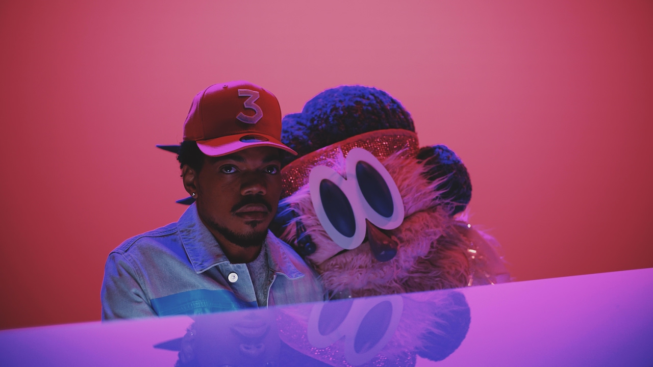
This song was a challenge for me to illustrate, as I knew I wanted to use childlike imagery to convey mature ideas. Same Drugs is a song about the realisation of growing apart from someone you once loved, and the confusion that comes with this feeling, for both people. The music video features Chance singing and playing piano as a large Big Bird style puppet lolls on his shoulder, and eventually begins to sing alongside him. The video concludes with Chance leaving the music studio, and everyone he passes is a puppet. The video works well to show the disconnect he feels, from his lover and the world he perceived them to exist in.

Alongside the imagery of the video, the lyrics were also a large contributor to my decision to marry youth and adulthood while thinking of ideas for this.
"I thought you'd never grow up,
I thought you'd never,
Window closed, Wendy got old"
This line is the admittal of the change that his girl has undergone. Using the name Wendy as a reference to the storyline of Peter Pan, Chance presents a sad but playful outlook. At the end of Peter Pan, Wendy invites him to come and live with her so that they can be together and grow up, but Peter is unable to give up his eternal youth and opts to stay away. This is reflective of how Chance in the song realises that the girl has outgrown him. I really enjoy this dichotomy and I wanted to convey that disconnect between youth and childhood as well as differing aspirations and outlooks that contribute to a relationship breaking down.
I chose to use lollipops as a visual metaphor as they clearly convey childhood and innocence, and a shattered one immediately suggests to me a loss of innocence, a realisation that maybe everything isn't going to be okay, or the way you thought it was going to be. It also represents the sudden crushing reality of a dream not working out in the real world. The main lyric that made me want to explore this is in the final verse:
"The past tense, past bed time,
Way back then when everything we read was real and everything we said rhymed."
The "past tense, past bed time", to me speaks of stories and dreams respectively, things that children depend on to develop, but as they grow realise are very different to how the real world operates, and they grow out of them. The second line speaks to the optimism of youth, and the optimism of a new relationship; everything seems like its going to be okay, the world seems on your side and you feel that you've found someone who understands you. And this song explores what happens when this all breaks down over time, and it frustrates you because nobody is to blame.
I really engaged in the exploration of this song and I think that helped me make a successful illustration for it. This is what I feel is really advancing my practice, the contextual understanding of material such as music and film is helping me deal with more complex ideas and heightening my work on a conceptual level, rather than just aesthetically.
Illustration12 - Nick Cave & The Bad Seeds: Rings of Saturn
Out of the four songs I chose to illustrate for this brief, this is definitely the one I would say I was the least engaged with. Musically the song didn't really jump out at me, and the lyrics aren't rich with that much imagery to draw from. This close to the deadline though, I've just been trying to make the best of what I've got. The main driving force here was trying to create a surrealistic image to recreate the line in the song describing someone "dangling dreams off the rings of Saturn". I immediately thought of melty surrealism when I heard this line, and having researched the origin of this song, I found that its partly inspired by the death of his son.
This context gave me a lot more inspiration in terms of ideas for visuals, colour and composition. I wanted the planet and its rings to double as a baby mobile hanging over a crib with the many tendrils coming down. After getting some feedback from people, I've also been told that the image reminds them of models on display at 1940s and 50s World Fairs, that celebrated post war technology as the path to a brighter future.

This isn't something I really envisioned when I designed this cover, but I found it really interesting that people could take something like this away from it when that's not really what I intended. Its helped me realise my communication can always be clearer when working in a medium like this.
This context gave me a lot more inspiration in terms of ideas for visuals, colour and composition. I wanted the planet and its rings to double as a baby mobile hanging over a crib with the many tendrils coming down. After getting some feedback from people, I've also been told that the image reminds them of models on display at 1940s and 50s World Fairs, that celebrated post war technology as the path to a brighter future.
This isn't something I really envisioned when I designed this cover, but I found it really interesting that people could take something like this away from it when that's not really what I intended. Its helped me realise my communication can always be clearer when working in a medium like this.
Most appropriate font ever
Thunderstorm!
The font is called Thunderstorm and my project is about Thor, I had to buy this font to balance the cosmos.
I'm enjoying messing around with the very different styles of upper and lower case in this font, as both evoke senses of the 80s with their odd angles and fluidity, but upper case is very hair metal while lower case is quite Miami sunset. I think this font is very suitable for my book and should go well with the characters I'm starting to think of.
Thursday, 20 April 2017
80s rad typefaces

Working on the type for the pages of my book that'll have the characters names on. I need something that suggests the 80s aesthetic without looking like its a neon sign on a brothel, so I have some filtering out to do.
Tuesday, 18 April 2017
Illustration12 - The Lemon Twigs: As Long As We're Together
This song was a challenge for me to get a handle on, as The Lemon Twigs are a band I already like quite a lot. Because of this I thought illustrating one of their best songs would be easy in comparison to those I hadn't heard before.
WRONG-O
I found the concepts raised in the song really vague when I tried to translate them into the visual, I didn't want to just copy pictures from the music video and digitise them because I've been trying to focus on getting strong ideas first. The whole song is a strange mix of 70s style fragmented musical narrative with big crashing electric choruses, and its a mad contrast on purpose, which makes it amazingly difficult for me to pin down a consistent theme throughout it. After playing with imagery from the album art and the video in this early version:
I felt that I was overcomplicating things in an effort to try and fully explain this song in a single image. I want to illustrate the nature of the song rather than the entire narrative of it, so I chose to focus purely on shape based composition to achieve that.
I used the contrasting colours of pink and yellow to convey the clashing styles of music present in the song, and also the electric relationship between the speaker and the subject in the song. I wanted the shapes to compliment each other in a way that if one wasn't there, the design wouldn't work, communicating the message of "As long as we're together, I don't see what's wrong with that". There's an optimism to the relationship in the song, and I thought that neon signs often connote excitement and thrill, so I based the colour choice and shape choice on that imagery to communicate the fresh and exciting nature of the relationship the speaker and the subject share.
The main thing that doing this brief and my self initiated Secret7 brief has taught me is that its vital as an illustrator to have context, and know what it is you have to understand and translate. It isn't enough to 'like' a song in order to be able to comprehend it on a level that you can translate it into a completely different medium and still make it recognisable. Both these briefs have taught me the importance of research in idea generation.
Subscribe to:
Comments (Atom)


