Wednesday, 29 March 2017

Group tutorial notes

Comment on what is working well about the project idea and research
  • working with mythical stories of monsters inspired by Dungeons and Dragons manuals etc
  • characters working well - works well portraying characters as cartoony and stocky rather than stereotypically 'hench' or comic styled
Comment on the quality and quantity of sketches/development done so far
  • Response to Neil Gaiman work - the graphic elements and portrayal/translation of character works well, good that you haven't gone for generic
  • see the illustrations as motifs
Constructive feedback on ways the project could be strengthened/development
  • could design a Greek style portrayal
  • symbolism related stuff is interesting, keep looking at Norse etc
  • keep doing tests and roughs etc

Wednesday, 22 March 2017

Peer Review notes

Comments on the quantity and quality of the images in development
  • sleek, well constructed images
  • colourful and pops
  • looks like finished products (hm I don't think so though)
Comment on whether the images in development work well as a set
  • work well for a book, narrative
  • comes from a researched perspective
Feedback on way this project can be strengthened
  • further development
  • posters, t shirts, album covers
  • make a load and then pick your favourite

Tuesday, 21 March 2017

Digital characters - 80s inspiration

I started to apply the way of working I've been applying in Responsive to my Norse project, using digital methods to change how I think about character design.
I've been having a lot of difficulty working successfully in my sketchbook recently so working like this has been really helpful in being able to mess about with different compositions and colour combinations.


My main inspiration for these is the weird colour barrage style of 80s cartoons like Transformers, He Man, Teenage Mutant Ninja Turtles etc. The wild characters and locations aren't very dissimilar to Norse tales of people having children that are wolves, eight legged horses and hammers that control the weather.
The character of Thor can be seen throughout popular culture, inspiration for He Man and big action stars of the 80s and 90s. It could be argued that ancient tales of massive guys with superhuman abilities were a big part of the creation of superheroes in the first place in the 30s.
Which is why its interesting that the actual character of Thor has circled back around into the mainstream entertainment media, since appearing in Marvel comics in the 60s and 70s and now in the Avengers films, the God of Thunder that predates Christianity is an action movie star.

Saturday, 18 March 2017

COLLABORATIVE - Finalised submission posters

Matt and Connell have finished the poster element of our proposed campaign, and we're all really happy with the way they've come out.
Image result for success gif

I think these posters speak to our strength as a group, as Connell's graphic design skills have really been the spine of the professionalism of this project, and very much so towards these posters.

Our posters are themed around the concept of Less is More to reflect MUBI's policy of only featuring 30 films at any one time. We exploited that for humour, comparing the abundance of other sites like Netflix to over the top exaggerated every day situations, such as getting in the bath with a scuba suit or using a thousand different dinner knives to eat beans on toast. I feel that the humour comes across really well in these without them coming across as a joke, they look professional but there is that tongue in cheek irony underneath.


Friday, 17 March 2017

COLLABORATIVE - Final YouTube advert editing SESH

Me and Connell have spent many hours over the last two nights editing together our video for YouTube and it's finally ready in time for the deadline on Wednesday, thank CHRIST
Image result for relief gif

The video isn't perfect and given more time I'd definitely take more time to edit it to a more professional standard, to fix some of the issues with pitch and a couple of abrupt cuts between some of the footage. But to say were both pretty remedial on After Effects, I'm really happy with what we've managed to pull off here.
The advert is designed to be placed in an ad spot before a YouTube video, so we used a catchy, interesting song to capture viewer interest, and a clip from the enigmatic Samuel L Jackson to snare anyone who was considering skipping (would you interrupt Sam Jackson halfway through a sentence? I thought noT)
Matt has uploaded the file to his Vimeo account, but I've embedded the original MP4 file below.


Thursday, 16 March 2017

Songbird Lino

After having my tutorial I aren't sure how exactly I'm going to use this design but I've already drawn it into the lino now so I'm going to cut it and see if I have time over easter to make a couple of prints from it. The main reason I wanted to study the Songbird was because it was an aesthetic that really interested me, but I've moved away from this 20s monster fiction recently to the more 80s neon action design. I enjoy cutting lino and I don't really use that as a traditional print method very often so I feel that cutting it will at least be good practice in lino print.

Wednesday, 15 March 2017

COLLABORATIVE - finished photoshoot!

HI THERE


Our photoshoot went really well yesterday, we got about 600 photos to choose from over a full day of antics. Our ideas for "Less Is More" worked a lot better in practice that we actually thought it would, it was really funny to see those ideas in practice and off paper.
We achieved the main visual ideas we wanted to, using props to make situations purposely over the top. Moving forward from here my responsibility in the group is focusing on the movie clips we've been collecting, editing them into a comprehensible state that we can manipulate them in, and writing a script for the 30 second advert designed to go before a YouTube video.

Connell and Matt are working on making physical posters for the advertising campaign, designed to go inside magazines, on bus stops, and other tangible places in the real world, as opposed to the advert I'm responsible for that will only really exist online.


Tutorial notes + American Gods

The main takeaway of my tutorial on Friday was to focus on making the outcomes for my book. My plan is to make six illustrations of Norse Gods reimagined in modern media, similar to this Folio Society edition of Neil Gaiman's American Gods.

I really enjoy this direction, especially because we just learned how to make books and I really enjoy that physical process.
American Gods has similar themes to what I've been researching so far, being centred on a story of gods who only exist because people believe in them, and how their powers have declined with the lack of modern belief systems and America's rising obsession with media, celebrity, technology and drugs. The book is full of characters and archetypes that represent a lot of different religions and factions of American society, and its something I've really enjoyed reading into.

I've decided to focus my own project on the Norse gods specifically, but in the future I'd really enjoy researching further into this kind of representation of different religions and gods and idols that characterise them.

Monday, 13 March 2017

COLLABORATIVE - Preparing for the shoot

We've scheduled to meet up this week as a group at Connell's to get started on realising our ideas. We're moving forward with the "Less is More" idea, focusing in on MUBI's service as a limited range of quality films, rather than an unlimited supply of mediocre ones. We're mainly using humour to get this across, and we've planned a photoshoot to explore some over the top ideas that will double as metaphors for being inundated with too much choice on streaming sites like Netflix and Amazon.

Connell and Matt went into town and into Headingley at the weekend to buy some props, we all pitched in but I couldn't go because I'm at work on weekends. Everything is more or less set up, we took out cameras and lights today and our ideas are developed enough to start taking photos and finalising them.

Friday, 10 March 2017

Never back-talk, never lie, or he'll drop you from the sky.

Moving forward, I've begun to investigate characters through history that have acted specifically as guardians and protectors. My main reason for this was coming out of my initial research of Ayn Rand's Objectivism and its disdain for idols and religion. I have started researching the tale of the Greek Titan Atlas, whose sole purpose is holding the world in place.
Image result for greek myth atlas
I'm really interested in moving forward with these sort of gods/idols, who exist as stoic protectors of humanity, they give people invulnerable hope and unshakeable faith. The idea of one figure being in control of the security of the world is something that is carried into the narrative of the Bioshock games (which were inspired by Ayn Rand's theories and novels), in the character of the monstrous Songbird.
Image result for songbird poster bioshock

The Songbird is a giant winged monster that acts as the guardian of the floating city of Columbia, which is a narrative parallel for an idealised America at the turn of the 20th century. In the game, it is the subject of heavy handed religious and patriotic propaganda, appearing as a moral constant, rewarding the good with safety and protection, and punishing the evil with death. Due to the early 20th century industrial nature of the Songbird's design, I'm going to study it in lino, to capture the gears and leather that make up the body of the monster.

Atlas Shrugged

Keeping with trying to unpick the theoretical side of my project, I have begun to investigate narrative texts that deal with similar issues to the one I'm dealing with.
I came across Ayn Rand and her theory of Objectivism when researching the nature of the story of Bioshock, which revolves around human dependence on religion and idols to cope with life. Rand suggests that what we see is very much what we get, and there is nothing extra to be gained through faith or belief in certain myths and religions. The only way she believes humans can improve themselves is through the advancement of science, discovery and industry. I'm finding it really interesting reading up on this topic because it is a perspective that is parallel to what I've been looking at so far in terms of how people have faith in gods and idols.

Her theory is quite devoid of hopefulness or faith, she is a clear atheist, and focuses on what is real in terms of what can be seen, touched and heard. The base of her theory is that existence IS identity - the fact that we are means that we are something, we are comprised of our brains and our bodies, not our 'souls' or 'minds'. This school of thinking is an interesting one in relation to gods, as it clearly has no time for such things as they are considered a waste of our one valuable life on earth. It is also an intrinsically capitalist theory, as it is focused on the self interest of the individual above all else. This is an interesting stance as most societies throughout human history have been based on working in the promise of an afterlife, the love of a god, rewards from above, or salvation from punishment. In this way, Objectivism sees itself as progressive, ahead of the 'savages' that worship the gods in the sky.

The title of Ayn Rand's final novel, Atlas Shrugged, is a reference to the Greek Titan Atlas, who was tasked with forever holding the world up.
Image result for atlas greek mythology
Beefcake.
The title communicates that Atlas has finally shrugged, giving up his responsibility to keeping the world stable. This acts as a parallel for the narrative of the novel, in which there are clearly no saviours, no gods to protect us, and no one up there to care about us. Objectivism is a theory I'm going to keep running parallel alongside the rest of my research because its a very interesting argument that I feel is inspiring a good counter to the concepts of the survival of gods through religion into popular fiction.

Books glorious books

Moving into the theory of my idea, I decided to move into some books for my research to get some perspective on the idea of the repetition of history and the representation of gods.

Image result for john yorke into the woods


Image result for norse mythology neil gaimanJohn Yorke suggests in Into the Woods that basically all our stories are all related to each other thematically. Alice in Wonderland to Toy Story to Saw, our heroes, villains and quests repeat themselves over the course of history. He states that "Storytelling has a shape. It dominates the way all stories are told and can be traced back not just to the Renaissance, but to the very beginnings of the recorded world" "a universal archetype".

Neil Gaiman's Norse Mythology retellings have formed a solid basis for the aesthetics of my character and spatial design. His characters have the morals and core concepts of the ancient gods, but with modern mannerisms and relationships. The modernisation of these characters makes them relatable and human, through the use of comedy and dialogue, that wasn't really present in ancient myth. We knew what the characters relationships were, but without really reading tales of their daily lives and how they interact. This perception of them has been useful to me as it allows me to draw more of their character out of this book to use in my own drawings.

Celtic Art has been useful in researching mythological symbols and their individual meanings. There's also a lot of information regarding how different cultures perceived each symbol. For example, the Norse symbol of the sun wheel was eventually adapted into the swastika of Nazi Germany. Investigating these symbols has been interesting for me as I didn't really consider the symbolism of religion and myth when starting this project, but it has been one of the most enduring and most recognisable factors of both. Moving forward I intend to keep referring back to this book to make sense of the origins of certain symbols and how they have been (and can be) adapted.

Digital Roughs

Going off the back of how I've been working digitally in my self initiated Oscar briefs, I've tried to throw myself into the production of some digital roughs rather than getting too bogged down restricting myself to a sketchbook.
I'm beginning by exploring the fictional realm of the Norse Gods, Asgard as a tech-noir run down city with heightened futuristic aesthetic.


In regards to what I want to make as outcomes - I enjoyed making small shape based poster prints for Responsive so I'd like to carry that aesthetic over here into for Applied. To further this I'd like to start thinking about illustrating landscapes similar to concept art for the cityscape.

Image result for moebius city


These landscapes by Moebius are forming the basis for how I'm thinking about making Asgard look moving forward. I think I need to return to basic methods like measurement and thin line quality to understand how to make appropriate perspectives and designs to make this idea work.

ASGARD - Home of the Gods

The home of Norse gods like Odin and Thor, Asgard is an ancient mythical citadel that pre-dates Christianity. As it doesn't exist as a form of afterlife, there isn't really a parallel for Asgard in Christianity, so the idea of it has been left behind in Norse mythology.
Asgard has survived into modern popular fiction through Marvel comics, and its inclusion in The Mighty Thor comics in the 60s. Jack Kirby, the first writer on The Mighty Thor, said in a 1992 interview "[I] knew the Thor legends very well, but I wanted to modernize them. I felt that might be a new thing for comics, taking the old legends and modernizing them."
This is a sentiment that is a big driving force for me heading through this project.
The modernization of Asgard continued into the silver age of comics, appearing as a technicolour technological wonderland.
Image result for asgard marvel comics 70s

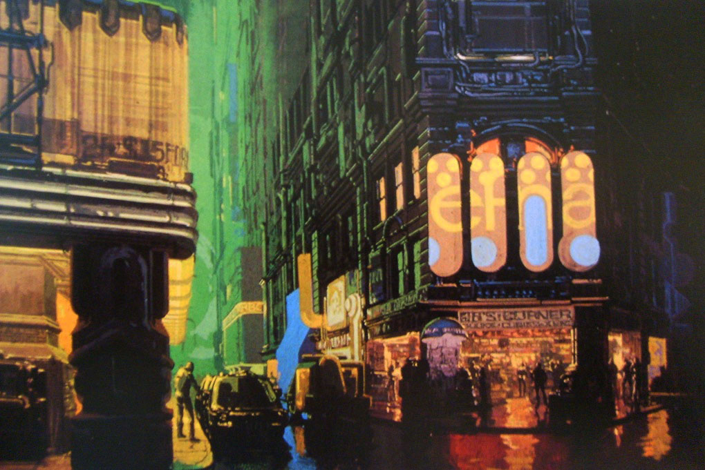
I'd like to take this modernisation one step further and try to deconstruct this perception of Asgard into a sort of tech-noir neo-dystopian world like that of Blade Runner.


This is original Blade Runner concept art by Syd Mead, in the Art of Blade Runner. The heightened technology merged with the dingy aesthetic is very interesting to me, and I'm going to combine these juxtaposing themes with the lofty imagery of Norse mythology.


Project Proposal - Applied Ilustration

Project Rationale:

What do you intend to do and why?
Investigate the evolution of heroes and villains/gods and monsters, throughout history and how their messages, appearances and purposes have changed over time.
To understand why we as a society put our faith and our fears into idols, and how different socieities create different versions of these idols.
Understand our human dependence on fiction.
I intend to make a book/short publication with some accompanying posters.

THEMES/SUBJECTS:

General themes
Fictional idols - gods/monsters/heroes
How we deal with the events of real life by representing it in fiction
How our perception of idols has changed, real or fiction
I will use these themes to create a book that uses a simple narrative based on history that educates the reader on different incarnations of similar characters throughout history - e.g. the evolution of Thor from Nordic God to colourful comic book character to cinematic action star.

Specific subjects
The development of religion into myth/fantasy and the reverse of this process.
The nature of certain icons/symbols to represent certain morals.
What stories represent and why we always feel the need to write them.

PRACTICAL/CONCEPTUAL APPLICATION

Specific disciplinary area
Character design
Environment design
Posters & books

Audience/contexts
Fans of literature and comic books
People interested in theories about human thinking/morals

Production/distribution methods
Create posters, books, zines - visual guides with accompanying texts

CONTEXTUAL REFERENCES

Illustrators/designers/studios
Branch into advertisers that use well known characters
James Roberts/Alex Milne - representation of Marxism and the Russian Revolution in Transformers comics
Brecht Vandenbroucke - using visual narrative alone to tell a story
Alan Moore
Frank Miller

CREATIVE SKILLS
Develop digital work
Rough ideas more thoroughly before settling on one
Different methods of print - digital, lino, mono

KEY TEXTS
Transformers: More than Meets the Eye
Superman: Birthright/Red Son
DC Kingdom Come
The Dark Knight Returns
Greek Mythology
Norse Mythology

Thursday, 9 March 2017

COLLABORATIVE - movie quotes & advert progression


This week we've finalised what we want to do for our advert, the basic concept is to splice together several movie clips (from films that have been featured on MUBI in the past) in a way that will create a narrative running through the advertisement, complimented by written text that explains the actual site. For example, we'll have some information about pricing per month, and as if in response, a clip of Han Solo celebrating in the Millennium Falcon. This humour is the backbone of our approach to this whole thing, as we as a group feel that MUBI kind of takes itself too seriously as a service, like it's in some way too 'arty' for people who aren't massive film buffs, which would alienate that whole audience. We want to appeal to that missed audience with a bit of self referential humour.

In keeping with this, I've collected suitable clips from a few of the films featured on MUBI, such as Sam Jackson asking "I'm sorry, did I break your concentration?" and E.V.E from W.A.L.L.E giggling to herself. The reason I chose clips such as these is that they are vague enough when taken out of context that we can utilise them to look as if they're responding to the advert they find themselves in, and write our script around that whole idea.