Sunday, 30 April 2017

Digital roughing

I've not been finding my sketchbook a successful place to develop ideas recently because it takes me a long time to figure out hand drawn sketches in a way that I'm happy with, and with the little amount of time we've had going up to all these deadlines, I chose to stick to digital roughs moving into finishing up my final outcomes.


I'm experimenting with different ways to get across the basic shapes and colours of each character, I don't think either of these are near a finished point because their proportions don't lend well to a head on top (which is kind of vital to character design).
However I'm getting a lot more comfortable with how the colours are turning out, I think contrast is the key to make these illustrations pop in a memorable way.

Thursday, 27 April 2017

End of Module Evaluation

Project Report - issuu document

Secret7 - Banks: This Is What It Feels Like

My aim with this cover was to communicate an idea without using traditional imagery. I felt that this particular song should be illustrated without depending on just images and objects, as it is a song purely about the speakers feelings and perceptions, nothing tangible. Image result for banks singer Banks' pre-existing logo was a starting point for me in thinking about how to visually represent this song. It's all very geometric and based around symmetry and line form. These aren't aesthetic decisions I'm really comfortable with or experienced with, so I took this opportunity to give it a crack.

While I definitely think that this design could do with some extra development, I'm happy with how it exists alongside the song. This Is What It Feels Like illustrates a speaker who has opened up to someone else, only for them to suddenly retract and reject their feelings. I wanted the two circles to act as the two members of the relationship, connected but separated by complex barriers. The sound of the song is subdued and there's a tone of disappointment in Banks voice, I thought the best way to communicate that sense was by using underwater imagery in the background. The song sort of reminds me of someone being submerged, a floaty disregard for what she's even saying permeates the song, like she is so tired of feeling this way that she doesn't even really feel it anymore, and is just tired.

This overarching vibe is what I tried to capture in my illustration, and its why I didn't want to use traditional imagery as I don't feel it would have done justice to the ethereal nature of the song, or the confusion the speaker is feeling. I enjoyed working with more abstract concepts and visuals with this, as it presents the challenge of suggesting an idea without using direct visual metaphors or obvious iconography. This is something I'll be carrying into my practice moving forward, as it forces me to think outside the box and really focus on the strength of my ideas before being able to confidently move forward to illustrating them.

Tuesday, 25 April 2017

Secret7 - Tame Impala: The Less I Know the Better

The imagery here is taken largely from the music video for this song, which focuses on a basketball player losing his girlfriend's affections to the school mascot in a gorilla suit. It's a surreal concept with strange imagery that I wanted to convey using pattern.

Secret7 - Paramore: Hard Times

This was a last minute addition to my Secret7" brief portfolio, as the song was only released a few days ago. The song speaks of sadness and difficulty in life, but with a poppy upbeat melody bouncing along jovially. The mix of irony, big colour palettes and pessimism immediately made me think of ideals of PostModernism, so I took the imagery of the very 90s video and manipulated it into this abstract pattern. I really enjoy composing designs like this, I intend to keep researching similar methods and try to improve my reasoning and consideration while making work like this to give it a deeper resonance.

Monday, 24 April 2017

Secret7 - Banks - Fuck 'Em Only We Know

This design is inspired by 80s poster composition that I've largely been looking at during my 505 module. The song describes a relationship that is exclusive and special in a way that only the people inside it understand. It's an intense perspective, I wanted to convey the red-blooded emotion through sharp graphic imagery.

Friday, 21 April 2017

Secret7 - Chance the Rapper: Same Drugs

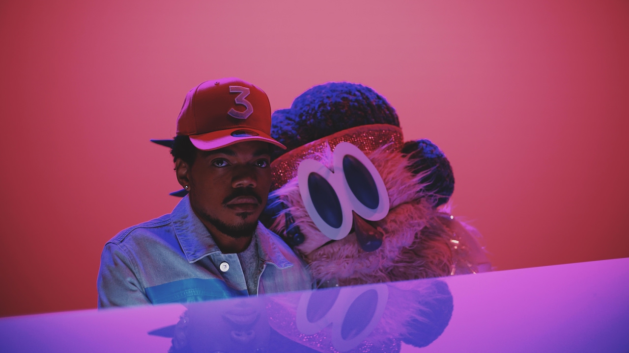
This song was a challenge for me to illustrate, as I knew I wanted to use childlike imagery to convey mature ideas. Same Drugs is a song about the realisation of growing apart from someone you once loved, and the confusion that comes with this feeling, for both people. The music video features Chance singing and playing piano as a large Big Bird style puppet lolls on his shoulder, and eventually begins to sing alongside him. The video concludes with Chance leaving the music studio, and everyone he passes is a puppet. The video works well to show the disconnect he feels, from his lover and the world he perceived them to exist in.

Image result for same drugs

Alongside the imagery of the video, the lyrics were also a large contributor to my decision to marry youth and adulthood while thinking of ideas for this.
"I thought you'd never grow up,
I thought you'd never,
Window closed, Wendy got old"
This line is the admittal of the change that his girl has undergone. Using the name Wendy as a reference to the storyline of Peter Pan, Chance presents a sad but playful outlook. At the end of Peter Pan, Wendy invites him to come and live with her so that they can be together and grow up, but Peter is unable to give up his eternal youth and opts to stay away. This is reflective of how Chance in the song realises that the girl has outgrown him. I really enjoy this dichotomy and I wanted to convey that disconnect between youth and childhood as well as differing aspirations and outlooks that contribute to a relationship breaking down.
I chose to use lollipops as a visual metaphor as they clearly convey childhood and innocence, and a shattered one immediately suggests to me a loss of innocence, a realisation that maybe everything isn't going to be okay, or the way you thought it was going to be. It also represents the sudden crushing reality of a dream not working out in the real world. The main lyric that made me want to explore this is in the final verse:
"The past tense, past bed time,
Way back then when everything we read was real and everything we said rhymed."
The "past tense, past bed time", to me speaks of stories and dreams respectively, things that children depend on to develop, but as they grow realise are very different to how the real world operates, and they grow out of them. The second line speaks to the optimism of youth, and the optimism of a new relationship; everything seems like its going to be okay, the world seems on your side and you feel that you've found someone who understands you. And this song explores what happens when this all breaks down over time, and it frustrates you because nobody is to blame.

I really engaged in the exploration of this song and I think that helped me make a successful illustration for it. This is what I feel is really advancing my practice, the contextual understanding of material such as music and film is helping me deal with more complex ideas and heightening my work on a conceptual level, rather than just aesthetically.

Illustration12 - Nick Cave & The Bad Seeds: Rings of Saturn

Out of the four songs I chose to illustrate for this brief, this is definitely the one I would say I was the least engaged with. Musically the song didn't really jump out at me, and the lyrics aren't rich with that much imagery to draw from. This close to the deadline though, I've just been trying to make the best of what I've got. The main driving force here was trying to create a surrealistic image to recreate the line in the song describing someone "dangling dreams off the rings of Saturn". I immediately thought of melty surrealism when I heard this line, and having researched the origin of this song, I found that its partly inspired by the death of his son.
Image result for 1950s world fairsThis context gave me a lot more inspiration in terms of ideas for visuals, colour and composition. I wanted the planet and its rings to double as a baby mobile hanging over a crib with the many tendrils coming down. After getting some feedback from people, I've also been told that the image reminds them of models on display at 1940s and 50s World Fairs, that celebrated post war technology as the path to a brighter future.

Image result for 1950s world fairs
This isn't something I really envisioned when I designed this cover, but I found it really interesting that people could take something like this away from it when that's not really what I intended. Its helped me realise my communication can always be clearer when working in a medium like this.

Most appropriate font ever

Thunderstorm!
The font is called Thunderstorm and my project is about Thor, I had to buy this font to balance the cosmos.

I'm enjoying messing around with the very different styles of upper and lower case in this font, as both evoke senses of the 80s with their odd angles and fluidity, but upper case is very hair metal while lower case is quite Miami sunset. I think this font is very suitable for my book and should go well with the characters I'm starting to think of.

Thursday, 20 April 2017

80s rad typefaces

 reddit.com: search results - logo design:

Working on the type for the pages of my book that'll have the characters names on. I need something that suggests the 80s aesthetic without looking like its a neon sign on a brothel, so I have some filtering out to do.

Tuesday, 18 April 2017

Illustration12 - The Lemon Twigs: As Long As We're Together

This song was a challenge for me to get a handle on, as The Lemon Twigs are a band I already like quite a lot. Because of this I thought illustrating one of their best songs would be easy in comparison to those I hadn't heard before.
WRONG-O
I found the concepts raised in the song really vague when I tried to translate them into the visual, I didn't want to just copy pictures from the music video and digitise them because I've been trying to focus on getting strong ideas first. The whole song is a strange mix of 70s style fragmented musical narrative with big crashing electric choruses, and its a mad contrast on purpose, which makes it amazingly difficult for me to pin down a consistent theme throughout it. After playing with imagery from the album art and the video in this early version:
I felt that I was overcomplicating things in an effort to try and fully explain this song in a single image. I want to illustrate the nature of the song rather than the entire narrative of it, so I chose to focus purely on shape based composition to achieve that.
I used the contrasting colours of pink and yellow to convey the clashing styles of music present in the song, and also the electric relationship between the speaker and the subject in the song. I wanted the shapes to compliment each other in a way that if one wasn't there, the design wouldn't work, communicating the message of "As long as we're together, I don't see what's wrong with that". There's an optimism to the relationship in the song, and I thought that neon signs often connote excitement and thrill, so I based the colour choice and shape choice on that imagery to communicate the fresh and exciting nature of the relationship the speaker and the subject share.

The main thing that doing this brief and my self initiated Secret7 brief has taught me is that its vital as an illustrator to have context, and know what it is you have to understand and translate. It isn't enough to 'like' a song in order to be able to comprehend it on a level that you can translate it into a completely different medium and still make it recognisable. Both these briefs have taught me the importance of research in idea generation.

Monday, 17 April 2017

Sketchbook woes

I'm really having trouble working consistently in my sketchbook. I feel restricted and I definitely feel that I aren't able to draw like I could last year, or even earlier this year. I feel much more confident digitally, I feel that I aren't doing sufficient work in my sketchbook and the work I am doing I just hate.

It's infuriating to feel like this because I have some ideas its just I don't feel like I can justify them on paper. I'm just going to move away from the sketchbook and use digital means to rough from here on I think because its going nowhere and I want to finish responsive in a good place and be able to properly focus on this module too.

Saturday, 15 April 2017

Roughs + character ideas


I've been trying to simplify my ideas down in this book because I'm finding it really difficult to draw recently what I'm trying to get across
I don't think these roughs are working at all, working in the sketchbook isn't really beneficial to me at this point I don't feel that my ideas are coming across and I'd rather get on with my final designs because of the impending responsive and cop deadlines after Easter


Wednesday, 12 April 2017

Illustration 12 - Gil Scott Heron: The Revolution Will Not Be Televised


I feel that this design could be stronger in relation to the weight this song carries. I aimed for a sombre, ironic image that captures the pacing of the song (which is really a poem first and foremost). Gil Scott Heron is suggesting in this song basically that the revolution will not be televised, because there won't be a point to it. He says that the real change in society takes place in peoples minds and hearts, which are things that broadcasting can influence but cannot fundamentally change. The revolution will be born out of people's desire to change things, people can be told to see things certain ways, but you cannot truly make someone feel a certain way in their mind.
Throughout the song, Gil returns to the titular phrase, outlining what the revolution will not include:
"The Revolution will not be brought to you by Xerox"
"The Revolution will not make you look five pounds thinner"
"The Revolution will not be right back after a message"
The repetition hammers home the importance of the revolution, the social change needed in America, against the trivial nonsense people spend their time worrying about, such as tv sitcoms and diet products. I wanted to express this through the image of the TV on static, having the one product that churns out all the information be broken, leaving the audience to make up their own minds about things and what needs doing. I researched 60s and 70s error TV screens for visual inspiration, to make it clear that the TV in my image is broken, reflecting the desire of the speaker in the song for people to get out of their houses, stop depending on the television for their information and inspiration and making decisions for themselves, being the change they want to see in the world.

Image result for 70s tv error screenImage result for 70s tv error screen

Illustration 12 - Let's Eat Grandma: Deep Six Textbook

In the end, I decided against using hand drawn elements in this design, as they work really well to develop my ideas, but there's too much of an aesthetic clash with the digital method I'm trying to understand through these covers. I'm happy with this final version, I simplified the elements down to a stage I felt comfortable they are recognisable while still retaining a surreal and strange visual style. I mainly just wanted to capture the things the lyrics brought into my mind when listening to the song. The lyrics combine surreal underwater imagery with imagery of youth, school and the frustrations of being perceived as a child when all your feelings say to you that you're an adult (which of course in hindsight, you aren't). Specific lines that inspired my thinking here were:
"We live our lives in the textbook, and letter by letter
I feel like standing on the desk, and screaming "I don't care"
Oh, and I was such a quiet child, oh I, was I?"

This line really captures for me the feeling of emptiness than can often occupy a teenage mind. The speaker is clearly an introvert, but that doesn't mean she doesn't feel all the things everyone else is feeling and have the same frustrations of changing from a child into an adult. I wanted to capture this by having the surreal images of the tentacles encroaching on the boring image of the school textbook.

I bet the starfish wonder
Why we're so obsessed
Why we feel so stressed (boring)
I wish you all the best
You're making me upset (enduring things)

We're heading straight to the east coast
It's just gone bitter
The ocean doesn't care, the waves will curl our hair
In summertime, when days collide
Say, "Why didn't we? Why didn't we?"
Go
These two final verses of the song really brought my ideas forward, as they are so odd and surreal, using examples such as starfish and waves as having personalities, yet immediately relatable. I wanted to combine the surreal with the normal for this cover, because ultimately that's everything the song is about. I heard it as the inner thoughts of an introverted speaker, someone who is part of the real world but has no sense of really belonging there, the other world of the ocean is described as fantastical and calming, reassuring, while the real world is bitter and unaccommodating to people who aren't sure what they want from it. Once I really engaged with the song I found it much easier to come up with an illustration for it, as I feel more emotionally invested in it, and it matters to me to be able to represent those feelings visually.

Monday, 10 April 2017

Struggling - Illustration12 idea block oh dear

I'm really struggling trying to translate the songs from Illustration12 into visual format, I think because I'm not familiar with them and they're all quite different I need to approach them in a different way. My first attempts at Deep Six Textbook by Let's Eat Grandma aren't going so well:

None of the imagery is very striking to me, and I don't feel I'm really conveying the nature of the song. I think I need to simplify my approach, and come at this with knowledge of the music as context first, or else all my concept generation is going to be way off.

THOR: RAGNAROK


The trailer for the third instalment of the Marvel Thor films was released today, and it's everything to do with the aesthetic of my project!

The film looks to be taking visual inspiration heavily from the original zany colourful Thor comics of the 60s and 70s, while combining 1980s action/road trip movie elements in the way the film is structured. The way everything looks has given me loads of ideas in terms of characters and settings.
Image result for thor ragnarok trailer
Image result for thor ragnarok trailer Image result for thor ragnarok trailer The colours and shapes here scream 70s psychedelic comic book art to me, which is what this version of Thor has its real roots in. I find it fascinating researching the evolution of Norse myth into this colourful explosive blockbuster format.
Pairing Thor, a deity older than Christ, with the Incredible Hulk in this film is amazing when you really think about it. Its like if in a few years there was a film about Jesus romping through the future apocalypse desert with Mad Max. This trailer has been really helpful in guiding my aesthetic journey through the last leg of this project when ill actually be making my outcomes.

(The Incredible Hulk is not a part of Norse myth as far as I know)

Friday, 7 April 2017

Kingdom Come

Image result for kingdom come dc

I reread DC's Kingdom Come this week to get a contemporary mainstream critique on the role of gods and idols.
The story focuses on a future America under the domination of new superhumans who have taken over the law in the absence of Superman.
Superman is retired after society outgrows his ideals of truth, justice and the American way, people want more bloodthirsty protectors without the merciful nature of Superman that they argue has made him weak in the face of the many threats the world has faced.
The narrative of this book follows a priest who is taken along to the important events of the book by the otherworldly Spectre, to stand in judgement of the various characters and heroes of the story. There are running themes of fallen idols, and the different reasons people lose faith in them.

I took the representation of Superman in this book to be an allegory for the decline of traditionalist, mostly Christian values in modern America. Life moves too fast and is too busy to focus on outdated values that don't apply anymore. Superman is ultimately exiled by society when he refuses to execute the Joker after the clown prince of crime murders a huge amount of people in Superman's city, including Lois Lane. Another character, Magog, brutally murders the Joker for this, and Superman arrests him. However, the world is on the side of Magog, they believe the Joker needed to die and the weakness of heroes like Superman is a weakness and contributor to evil by the refusal to stamp it out.

These ideas can be linked to growing ideals in the world today that there are no heroes, especially no truly good ones. The more brutal the world gets, the more brutal society becomes in ideas of how to deal with things. Terrorist acts infuriate people to the level that they call for death penalties, fighting fire with fire. The meeting of violence with violence results in complete lack of faith, as the system becomes cyclical and violence becomes self serving. Radical thoughts give way for radical individuals to rise to power by tapping into this underlying social rage. (This has literally happened in America RIGHT NOW HELP)
I found this book really interesting in terms of how it links to the other standpoints I've been researching, as it presents a largely morbid view of how society views gods and how this has changed as humanity has advanced technologically. Humans are still animals with instincts, and when we feel threatened, these instincts can be manipulated and directed in dangerous ways, that is almost primal.
I think a dependence on idols is quite primal in itself, while also having a place in civilised society. More than anything, gods and religions exist as affirmers of reality, reassurance that we are here for a reason and what we do matters.

While it could be said that worshipping gods is outdated and a way that early societies dealt with things they couldn't understand, such as love, or death, it can also be said that the most human thing about us is the desire to be part of a tribe, and for our lives to have meaning. The easiest way for us to be a part of something greater is to believe in something greater that connects us all. I can understand why people still depend on these ideals as the world advances further and further from them.